April 12, 2018
Choose the Right Font for Embroidery
To pick the proper lettering, you need a solid understanding of the basics of embroidery.
Embroidery fonts are nothing more than software programs, but don’t let that fool you into thinking the computer will do all the work for you. To become proficient at applying embroidery fonts, you have to go back to the basics.
A key fundamental of sewing fonts properly is stitch length. Most fonts use satin (column) stitches. The width of a column is defined by the length of stitches used to sew it. With fonts, the width setting is referred to as column width, which is typically increased or decreased using percentage values, not stitch length values. As a result, the user has no clue as to what the actual stitch lengths are.
A stitch requires two penetrations of the needle, thus the length of the stitch can only be so short. Normal embroidery stitch length range is 2 mm to 12 mm. Though it’s possible to create something slightly shorter, stitches should never be less than 1 mm long. I tend to be conservative, however, and won’t go shorter than 2 mm unless I’m digitizing the stitches myself. There’s a logical reason for this: the size of the needle.
If you’re sewing with an 80/12 needle, then each needle penetration creates a hole with a diameter of 0.8 mm or a radius (outward from center) of 0.4 mm. In the case of a stitch that’s 1 mm long, the sewing process will create two holes with a radius of 0.4 mm each, which leaves only 0.2 mm of fabric untouched between the outer boundaries of the holes. That’s not much to work with. Of course, the hole will usually close back up around the thread after the needle is withdrawn, but the fabric still has been affected and potentially weakened. In this situation, if the stitch length were 0.8 mm instead of 1.0mm, you would probably be sewing holes in the garment, rather than laying down stitches.
On the other end of the spectrum, long stitches have their own set of issues. As a stitch becomes longer, it becomes less stable, since the distance between needle penetrations, which are the anchor points, is increasing. As you go beyond 12 mm, stitches become loose, possibly resulting in gaps. Long stitches are also prone to snags. In addition, long stitches can affect how your machine sews, forcing it into jump stitch mode or slowing down the machine.
Another factor at play is that when you try to sew certain letters at the smaller end of the font size range, closed letters such as O, Q, P, D, B, have a tendency to “close up” during sewing, especially when dealing with smaller formats. This is typically due to the pulling action of the sewing process, which forces curve-shaped elements to pull inward when sewing.
The natural tendency is to compensate by reducing the column width, which in turns reduces the stitch length, which may cause more problems than it fixes. Welcome to embroidery.
Armed with this information, you’re ready to evaluate fonts in terms of embroidery quality. Each stock font has an acceptable size range for which it will usually produce reasonably good quality embroidery. Because letters have varying column widths, stitch lengths vary. Thus, the first rule is to make sure you stay within the recommended size range for a given font.

Complex type styles such as Old English work great as long as you can read them. But as you go to smaller sizes, the details tend to get lost in the design. Instead of an elegant look, you end up with a glob of threads and a lot of thread breaks. On paper, Old English looks fine a quarter of an inch high, but if you try to embroider it, the O and E will be an utter mess, while the “g” and “h” will be virtually impossible to decipher, as they will close significantly.

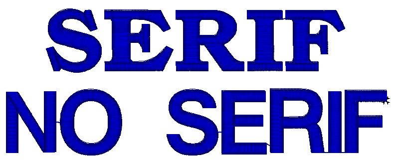
Many fonts use serifs, the little “thingies” on the tips of letters that run perpendicular to the segment for which they are attached. How’s that for technical? Serifs add a lot to the look of a font, but they can be tricky to sew when dealing with different-sized lettering. Rather than avoid using fonts with serifs, you simply need to pay close attention as to how they are sewn.

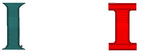
Look at the two capital I’s pictured. The version on the left is Goudy Bold. On the right is Brantford. With the left version, the serif is created by increasing the column width to create longer stitches. The right requires sewing separate segments for the serifs. Goudy Bold is the better choice for small lettering, whereas Brantford is the choice for larger lettering. Think about this when evaluating a font for different size applications.

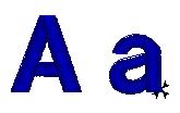
Note that the software applies the height setting to the tallest letter. For example, if you set the size to be a quarter-inch high, then the capital A pictured will be a quarter-inch high, while the lowercase next to it will only be about one-eighth of an inch high – half the size. That’s probably too small to sew properly, if at all. With smaller lettering, you’re often better off using all capital letters.
It’s important that you point out small-letter limitations when writing the initial order. Steer your customer toward either upper-case letters or larger letters. If the customer doesn’t understand the issue, pull out a needle and lay it across the artwork, to give them a quick visual lesson about the physical limitations of embroidery.
***
Jimmy Lamb is an award-winning author and international speaker with more than 25 years of experience in the apparel decoration business. Currently, he is the manager of communication at Sawgrass Technologies.