April 04, 2018
Fix Low-Quality Artwork in Photoshop
Try reducing noise or replacing the text to improve the overall quality of the file.
The real problem in this industry is low-quality artwork. Customers often have no idea about file resolution and file quality. They’ll say that “it looks great on the monitor,” but if you ask whether they zoomed in, they draw a blank. And the question of the day seems to be: “Can I use a JPG?”
A day in the life of a screen printer involves dealing with 72 dpi files that are physically small, and low-quality JPG images. Often, these same files started out as high-quality vector files with sharp edges – but then someone decided to “do you a favor” by saving the file as a JPG and reducing its size.
The JPG format is a “lossy” format that loses parts of the file forever. Most other compression formats used to make files smaller keep most of the detail in a file. A JPG file can be saved with a quality of zero to 12, with zero bring trash. But hey, it makes for a really small file. The lower the quality of a JPG file the more “artifacts” – noise and confetti around images – and “boxes,” where the compression routines tend to average out areas of color.

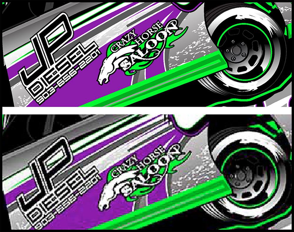
Pictured is the same file. The bottom version is 72 dpi, the top 300 dpi. Upsampling an image can help you fix it for screen printing.
Check your file resolution: It’s important to know the resolution of your file (whether JPG or not). It would be nice if the file was 250 to 300 dpi at the final print size. In reality, most JPG files are off the internet and are 72 dpi and small physically in size. You can easily check the resolution of the file in Photoshop by going to Image/Image Size. To give you a better shot at fixing the file, upsample a low-resolution file to 300 dpi at the final image size. The file may be soft, but not as pixelated.

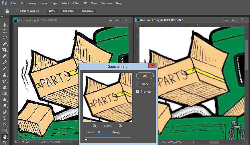
Using a Gaussian blur can help remove artifacts and "boxes" from low-quality artwork.
Use Gaussian blur: One way to remove the “boxes” in a JPG file is to apply a Gaussian Blur (Filter/Blur/Gaussian Blur). Sometimes, only one channel of an RGB is really boxy, and you can apply a blur just to that single channel rather than the entire composite RGB file. You’re better off having the image a little softer than with all the artifacts.
Reduce the noise: Photoshop should have a much better JPG enhance routine (there are a lot of them on the web), but it doesn’t. However, you can use Filter/Noise/Reduce Noise to help soften the boxy areas, and you can check Remove JPG Artifacts at the same time.
Replace the type: Type is what really suffers at low resolution. The corners are no longer sharp, and the edges are soft. If the type is not tied into graphic elements, you should simply replace it. You can replace the type directly in Photoshop on a new “type layer,” or you can create the new type in your favorite vector program (Corel or Illustrator) and then Save As a PDF in those programs. Open the file in Photoshop, and combine the layers of your new type and the raster elements into one file. You have the best of both worlds – as long as you’ve upsampled to 300 dpi before you do this. Sharp type will help the poor-quality graphic elements appear better. Be aware that if you add the vector type before you upsample, the lettering will be low resolution.
As always, it’s best to ask for the highest-quality file you can get, but when that’s not an option, you don’t have to turn down the job. Instead, you can make it work by fixing the resolution, improving a low-quality JPG and replacing the type with crisper lettering.
***
Scott Fresener has been in the industry since 1970 and is the co-author of How To Print T-shirts For Fun And Profit. A popular speaker at trade shows, he runs the website T-BizNetwork.com. Reach him at scott@tbiznetwork.com.
