April 24, 2019
How to Upgrade Your Screen-Printing Art
Keep your designs clean and crisp and printer-friendly.
My guess is there are a lot of times the press operators struggling to get a design to work mutter under their breath, “Who designed this?” We’re not just talking about simple images – we’re talking about higher-end, complex images or even simple images with a lot of gradations and shading. Here are some tips, tricks and ideas to make your artwork more screen-print friendly.
Stop overdesigning and overthinking: Great artists learn to keep things simple. If you look at websites from 15 years ago versus today, you see all the good ones have gotten away from embossed type, mixed fonts, lots of colors, etc. They’re clean and easy to read.
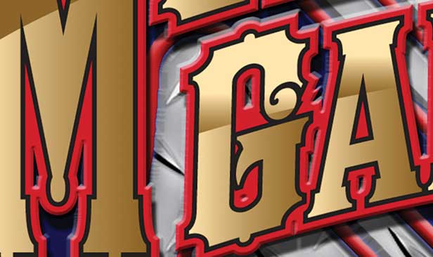
T-shirt images need to be the same way. It seems young and/or new artists just love to use effects because they’re cool. It’s not about being cool to the artist but being readable and printable to the customer and printer. Figure 1 shows a sample from a real job. I can’t show the entire image because I have to protect the innocent. Never forget the goal of a T-shirt graphic: to convey a message, show branding, show a company name and be readable. If you do all these things, it should print better.

Figure 1: Avoid overdesigning with too many “cool” effects, as pictured. Focus on designs that are clean and easy to read.
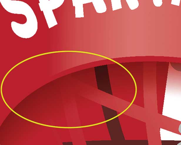
Reduce the amount of subtle gradations: Again, this is from designers who don’t do much T-shirt work but create images with a lot of very subtle color changes and shades. Sometimes, it’s almost impossible to separate two very close colors, and if they’re different shades of one color, once you factor in dot gain at the press, both colors will look the same. See Figure 2.

Figure 2: Subtle color gradations like this will be lost during the screen-printing process.
If you must use shading (no problem with that), be bold and brave with it. Keep in mind the image will probably end up looking flatter once the job is converted to halftone dots, put on screen mesh and printed onto a shirt. Halftone dots gain about 30% to 40%, and subtle changes get lost.
Work at the right resolution: The standard resolution for T-shirt images is 300 dpi. The problem is a lot of artists work at lower resolutions like 72 dpi for web graphics, then wonder why the image is so soft when it’s enlarged to T-shirt size and upsampled to 300 dpi. Try to work at 300 dpi. If you’re using a 72 dpi web image, at least make the file 300 dpi BEFORE you start adding type and other elements.
Learn to fix low-quality JPG images: I’ve written here in the past about how to fix a poor-quality JPG. (You can also do a web search for tutorials and inexpensive JPG enhancement programs.) A low-quality JPG will have artifacts and blotchy areas that can show up in the color separations.
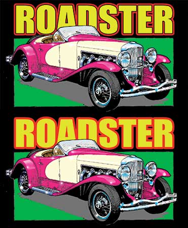
Design so your press guys will love you: Again, non-screen-print artists don’t often realize the problem we have of “wet-on-wet” printing where colors touch and can bleed into each other. I’m always shocked when I get a separation job that has yellow printing next to red (usually as an outline). This will never work at press unless you can flash cure one of these colors first. It would be so simple to put a small “gutter” or stroke (make it the shirt color) between two colors so they don’t touch at press, and the integrity of the image doesn’t change. See Figure 3.

Figure 3: Adding a gutter between two colors in “Roadster” will make it much easier to print.
In addition to taking these measures, be sure to talk to your press guys about what else you can do to help them get on and off jobs more quickly.
Scott Fresener has been in the industry since 1970 and is the co-author of How To Print T-shirts For Fun and Profit. A popular speaker at trade shows, he runs the website www.T-BizNetwork.com. Reach him at scott@tbiznetwork.com.