May 03, 2018
Keep Your Small Letters Crisp
Tiny text is one of the biggest challenges digitizers deal with.
When it comes to lettering, size matters. Digitizing quality small lettering is one of the most difficult tasks an embroidery digitizer can perform. Even the tiniest flaw is easy to spot, since everyone knows what letters are supposed to look like. Here are a few tips to help you create crisper, more attractive text.
Consider text width. It’s generally accepted that for high-quality text, letters shouldn’t be any shorter than a quarter-inch. That’s not completely true. The width of the column stitches that form the letters is as important, if not more important, than the height of the letters. Simply put, you can’t create a satin stitch that’s narrower than the needle used to form that stitch. For example, if the diameter of your needle is 1 mm, that’s the minimum width for your satin stitch. Any satin stitch you try to form that’s not at least as wide as the needle is thick will compromise the text quality, period. You can embroider smaller text if you use a smaller needle as well as a thinner thread. Typically, embroiderers use a 40-weight thread and a 75/11 needle, but you can try a 60-weight thread and a smaller needle like a 70/10. If you change one, but not the other, you’ll defeat the purpose of this advanced technique.
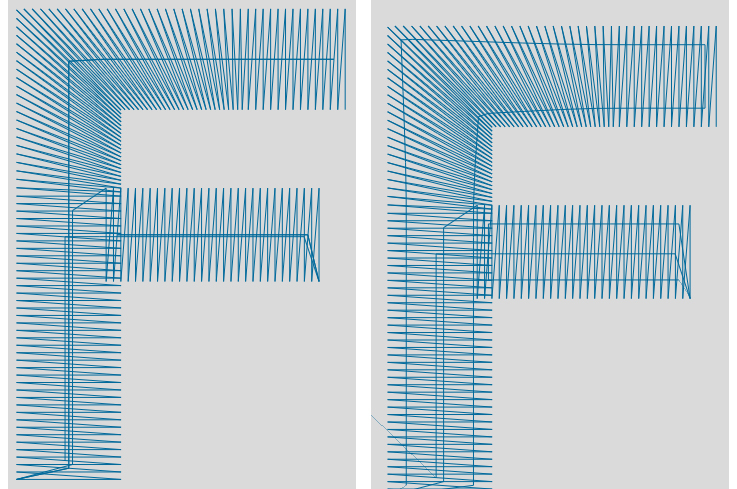 At left is and example of center-walk underlay. At right is edge-walk underlay.
Choose the right underlay. Underlay is critical to ensure there’s a good base for your letters to sew on. However, as with so much of life, too much of a good thing can be counterproductive. For example, never use an edge-walk (see figure 1) for underlay on small letters. On small columns, edge-walk underlay has a propensity to pop out the sides of the column. For smaller columns, consider a center-walk (see figure 2). Where possible, the stitches you use to move through the letter can be pathed to function as underlay as well. There are even times, though rare, when it’s appropriate to forgo underlay. This is usually true for really small letters on super-stretch fabrics. Moral of the story: Be prepared to experiment.
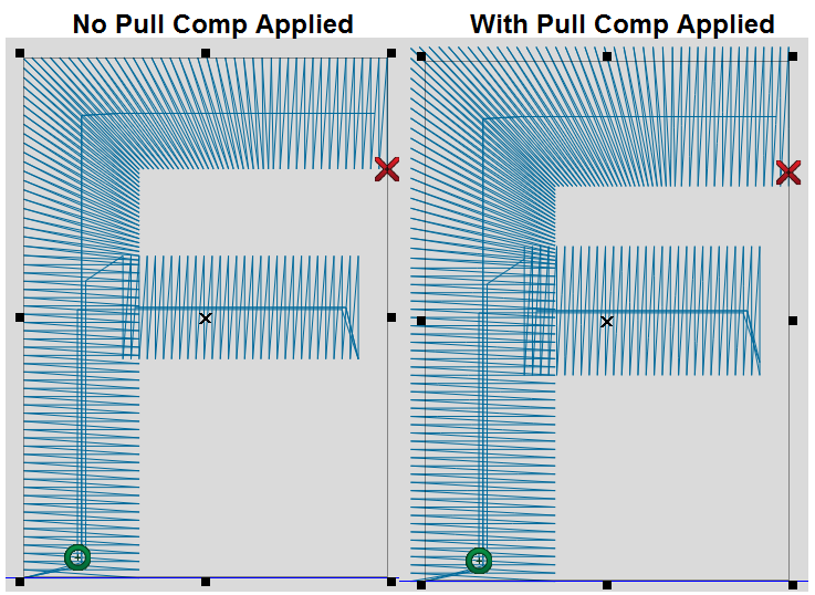
Notice how the columns are outside the box after pull comp is applied.
Understand pull compensation. Pull comp is a setting digitizers use to adjust for the natural tendencies of fabric to push and pull as stitches are applied (see figure 3). Lettering programmed without at least some pull comp will almost always bring undesirable results. It’s impossible to say how much to use because different circumstances require different levels; however, if your lettering sews out too thin, even though it seems like you programmed for appropriate column widths, you need to apply pull comp.
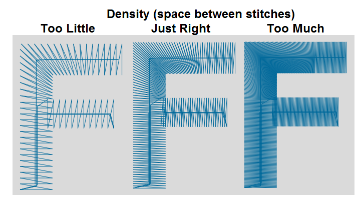
The center is an appropriate amount of density. Too much and too little density can be problematic.
Set appropriate density. When I was learning to digitize, my mentor once told me, “You can only put two pounds of coffee into a two-pound coffee can before coffee starts spilling out the top.” In the same way, when you try to cram too many stitches into too small of a space, bad things will happen, and you’ll have to clean up the metaphorical spilt coffee afterward. Density is the amount of space between stitches. It doesn’t matter if we’re talking about fill or satin stitches. The higher the density, the closer together the stitches. At a certain density, bad things start to happen: multiple thread breaks, puckering, holes in the fabric, letter holes filling in and more. As is so often the case, it’s impossible to tell you the correct density because it’s a moving target. What’s more important is to recognize the symptoms, so you can fix them. Figure 4 is intentionally exaggerated, but it illustrates the difference between what might be too little, too much or just the right density.
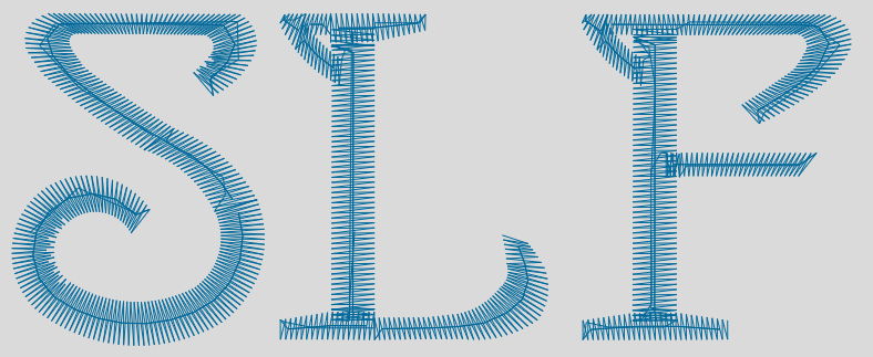
Fancy lettering tends to fare poorly when embroidered in smaller sizes.
Avoid tiny, fancy letters. Serifs and “fancy letters” that have variable column widths are terribly difficult to keep looking clean when letters are small. Simply put, when you try and get too much stuff in too small of a space, you’ll compromise quality. Embroidery doesn’t have the resolution of print media, and there are times when fonts need to be simplified to keep things looking good. In Figure 5, the font is simply too fancy for small text and needs to be simplified. When a font like this is embroidered in any size under about half an inch, it simply won’t sew well. Consider a simplified font.
No matter the circumstance, embroidering text is tricky, and for the most part, the smaller the text, the harder it is to keep it looking nice. There are many tricks of the trade to improve your digitizing technique, but the cold-hearted truth is that time and experience are the two most important factors for programming great text. Take your time, experiment with new techniques and remember that it’s not just you. We’ve all been through this.
***
Steve Freeman is the managing partner of Qdigitizing.com. He has been a professional digitizer since 1989 and is trained on Melco, Wilcom and Pulse software systems. You can reach him at steve.freeman@qdigitizing.com or (877) 733-4390.