November 28, 2017
Improve a Low-Quality Image
Photoshop has a few tools you can use to increase the quality of lower-end JPG files.
Bad artwork is an everyday issue for screen printers. There are two kinds of color separation customers: the easy ones who send 300 DPI artwork at the final print size with all the images high-resolution or vector, and the new customers who don’t understand computer graphics and often provide low-resolution, low-quality JPG images obtained online.
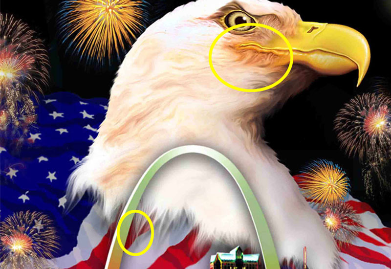
The good customers often build their images in-house and know what a color separator needs. But most of a separator’s customers “inherit” bad artwork from their own clients. When someone says, “Can I text you the image, or here is a cell phone image,” they will say, “Sure, I can use that.” And when they ask if there’s better artwork, the answer is always no.
Here are a few quick tips to help improve typical low-quality images to make them brighter, better, and easier to separate or print.
JPG images: The #1 file format that needs “fixing” is the JPG, a lossy format that compresses a file size, but also lowers file quality and may lose file information. JPGs can have a quality of 0 through 12. You can find the quality by doing a save as and checking the JPG Options window that pops up. A lot of people think saving as a low-quality JPG does nothing bad to the file. Wrong. When you make a file a low-quality JPG (1 to 7) you introduce artifacts, boxes and other imperfections.
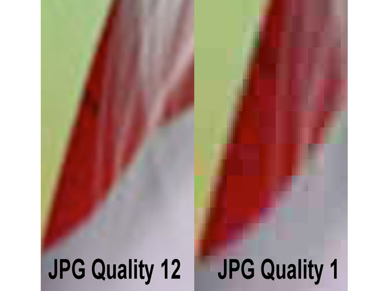
If you have a choice of whether to save as a JPG or PDF, always choose PDF. Most customers choose JPG, and don’t realize they just screwed up a good file.
There are a lot of JPG enhancement programs, and you can find them with web searches. Most are less than $75. If you can’t afford one, use Photoshop and one of its built-in filters. Here’s how it works: Zoom in on the file to see a close-up of the artifacts and boxes. Go to Filter/Despeckle. Then, go to Filter/Reduce Noise. Use Default Settings, Strength 10, Preserve Details 10%, Reduce Color Noise 20%, Sharpen Details 15%, check Remove Artifacts.
You will see the image soften slightly and the artifacts and boxes reduce. If the file is really poor, you can follow these steps again and again.
Sharpen images: I almost never use an image without first checking the sharpness. In Photoshop, go to Filter/Sharpen/Unsharp Mask (an old camera term). Each image will be different. Start off with a Radius of 1, Threshold of 6 and Amount of 300. You can move the Amount slider. See the difference? The edges get sharper and cleaner.
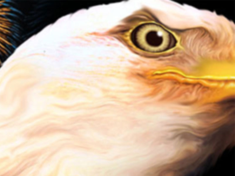
The image before sharpening.
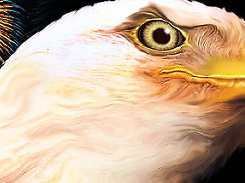
The image after sharpening is applied.
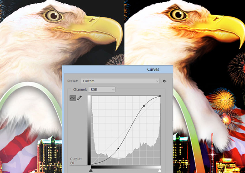
Low contrast and dull images: It’s not uncommon to have images that are just dull or low contrast. You need to boost the contrast and color saturation – especially if you’re going to color separate the image or print it on a DTG machine. You need to make the colors cleaner/brighter. My favorite tool for this (in Photoshop, of course) is the Tone Curve. You can take a flat image and use an “S” curve and make it brighter and higher contrast at the same time.
***
Scott Fresener has been in the industry since 1970 and is the co-author of How To Print T-shirts For Fun And Profit. He created two automated separation programs, T-Seps and FastFilms, and is considered a pioneer in the direct-to-garment printing segment. Fresener is the director of T-Biz Network and is a popular speaker at trade shows. Fresener is also past Chairman of the Academy of Screen Printing Technology and was on the Board of Directors of SGIA. He runs the website www.T-BizNetwork.com. Reach him at scott@tbiznetwork.com.