November 27, 2018
How to Keep Your Embroidery from Looking Dull
Changing up stitch type, direction and density can add interest to embroidery.
The creative use of stitch type, direction and density are the fundamental artistic tools available to the embroidery digitizer. Consider the award-winning design pictured. It could have been programmed flat and boring, but what separates this design from others is the creative use of digitizing tools. Here’s a rundown of those tools and how they were deployed to make this stunning design.
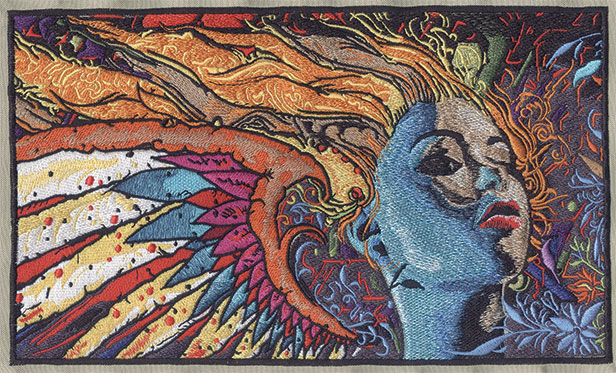
This embroidery design is a good example of creative use of stitch type, direction and density.
Fill stitch: One of three primary types of embroidery stitches, this is used to fill large areas where it’s not technically practical to use other types of stitching. If fill stitches are used without consideration to density or direction, they can be quite drab. However, used well, fill stitches can be rich and beautiful. Look at the lips in the sample image. All the stitches in this design element were completed with fill stitches, but by using varying colors, density and direction, a potentially flat portion of the design was brought to life.
Satin stitch: Though it’s used for many reasons, the satin stitch is primarily for providing depth, detail and bordering. In the pictured example, satin stitches were used for all of those reasons. The stitches separate filled areas and provide an explosion of depth and color throughout the piece. Close review shows the eyelids, for example, used a satin stitch to create a rounded, 3-D effect.
Walk stitch: This is used for fine detail, as well as machine movement and underlay functions. However, what separates the true artisan from a novice programmer is the use of “manual” walk stitches to provide depth of detail. Look closely under the right eye in the sample design. The black shadowing was achieved through the use of manual walk stitches. While it would be possible to achieve a similar result with a fill stitch, you wouldn’t be able to achieve quite the same level of layered detail.
Stitch density: This is used for more than one reason. The greater the space between stitches, the lighter the density; the closer together the stitches, the higher the density. This is important when layering threads for color blending. If all layers in a color blend are high density, then laying one color inside another would be like stacking playing cards – one solid layer on top of another. If the density is reduced, then stitches from different layers can lay in between each other to provide an illusion of color blending. This technique can clearly be seen in the blue shades used in the sample image’s cheek.
Stitch direction: This is also used for more than one reason. In the image’s cheeks, the fill stitches all run in the same direction to create the illusion of blended thread. Stitch direction can also add dimension. The nose and lips of the image have stitches running at angles opposed to the cheeks, ensuring these features stand out from the smoother, flatter fills of the cheeks.
Digitizing is as much art as it is science. How you use the tools available will dramatically affect the outcome of your projects. While it’s possible to make a design overly (or under) dense, there’s no right or wrong density. There’s density that’s right to that specific application. The same goes for stitch direction and type.
Steve Freeman is the managing partner of Qdigitizing.com. He has been a professional digitizer since 1989 and is trained on Melco, Wilcom and Pulse software systems. You can reach him at steve.freeman@qdigitizing.com or (877) 733-4390.