October 01, 2019
2019 Wearables Top Decorator Contest - Results
Decorators put their real-world skills to the test, designing an apparel solution for a fictional client. Find out who took the crown.
The best apparel decorators do more than simply put logos on shirts. They’re brainstorming, brand-building problem solvers. They’re up to date on the latest apparel styles and trends and know which garments will work best for each client. They sense when to deploy a traditional left-chest logo and when to suggest less conventional decoration. This year, we designed a contest to show off their diverse skillsets, working from a common-but-creative scenario: taking a client-provided logo and transforming it into a cohesive apparel solution.
For the 2019 Wearables Top Decorator Contest, we created a fictional restaurateur, Joseph H. Munch, who’s opening his latest venture: Forklift, a funky bistro with creative cocktails and seasonal farm-to-table fare. The Wearables editorial team created a logo for the restaurant and provided it to contestants, who were challenged to incorporate the logo (in some form) on at least two garments to outfit the eatery’s staff in style.
All of our entries got creative with the Forklift logo while still considering real-world issues, such as what kind of apparel would be most comfortable for a restaurant server to wear all day and how best to make the logo stand out. The winner and three runners-up are featured here, while all the entries can be seen here. Who cooked up a winning look? To find out, scroll below.
Grand Prize Winner
T Productions, Mishawaka, IN
T Productions used simple, durable plastisol prints on a soft, lightweight crewneck in vintage pine and a contrasting black waist apron.
Q What criteria did you use to choose the T-shirt in your entry?
Tony Kozlowski, owner: The top is so important because it allows customers to quickly identify who’s a server, and it gives off an immediate vibe. The vintage pine color helps bring to mind the farm-fresh nature of the restaurant, and it also complements the burgundy in the Forklift logo, as though you’re sipping wine in the woods. We kept the styles normal crewnecks to give off a casual appearance, and tri-blend fabric for softness and lightweight comfort. Short sleeves are a must for a restaurant that could get hot and hopefully very busy with customers.
Q: Why did you choose an apron as your secondary garment?
TK: Aprons are functional and further separate servers from the customers for easy recognition. Waist aprons are particularly handy because they’re less restrictive, more mobile, less uppity and more casual.
Q: Why did you create a shorthand version of the logo for the right leg area of the apron?
TK: It’s always good to have a simplified version of your brand to be used in areas that are too small to apply your full logo, so we developed the shorthand version, and thought it would work nicely on the apron, while still being instantly recognizable to consumers.
Q: Why did you add on a bandana to complete the look?
TK: Bandanas are a multifunctional accessory. A cook could tie one around his or her head, a server or other staff member could use one to clean small areas, or they could wear one in a pocket to generally look hip.
Q: Why did you choose plastisol ink for your prints?
TK: All the items we used contained some level of polyester, so we went with opaque plastisol with no underbase. This gave us a nice, durable print.
Q: What makes this ensemble ideal for a restaurant?
TK: All the items are comfortable and durable. Uniform apparel is likely laundered more than casual apparel, so choosing items and printing methods that can withstand that abuse was important.
Q: What advice do you have for other decorators tasked with outfitting the staff of a new restaurant?
TK: Make sure the apparel and decorating method fits the style of the establishment. Screen-printed T-shirts can work for casual restaurants, while embroidered polos or dress shirts might be a better fit for higher-end places.
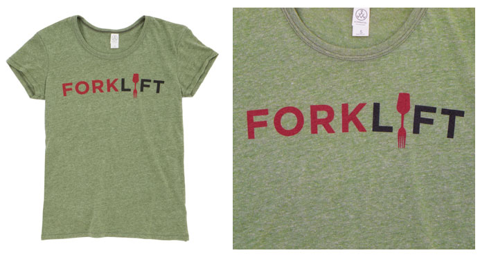
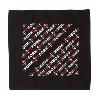
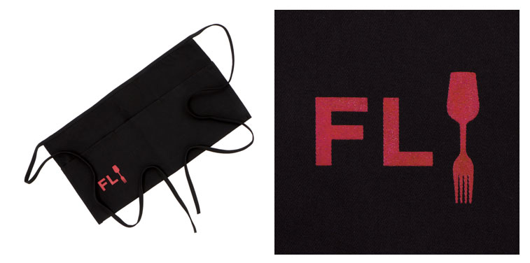
[At top] Women’s vintage 50/50 jersey T-shirt (5052) from Alternative Apparel (asi/34850), featuring a two-color plastisol screen print; [Middle] Bandana (BA001) from Big Accessories (asi/40485), featuring a two-color screen print; [At bottom] Oversized waist apron (2120) from Augusta Sportswear (asi/37461), featuring a one-color plastisol screen print.
First Runner-Up
Rush Order Tees, Philadelphia
Rush Order Tees used high-resolution imagery, simulated-process printing and a modern, stacked design to convey Forklift’s fresh and hip vibe.
Q: How did you come up with your Forklift outfit?
James Metzger, graphic designer: The design concept was to match what the company is all about. We used super high-resolution imagery to produce the best results, so it looks like you can eat the food right off the shirt. We were trying to show the freshness with the visuals and keep more of a modern design by having a stacked, organized group of ingredients, but in an organic, non-robotic way. We purposely made the fork in the logo poke into one of the red peppers as a subtle nod to the restaurant.
Q: What kind of technical considerations did you make to achieve your look?
JM: We chose garments with large print areas. With simulated process printing, the larger the print area, the better it will be in terms of details. In the printing process, we used a setting of 45 lines per inch on 230-mesh screens. After test printing on our automatic press, we made minor adjustments, such as increasing the speed of the squeegee on the gray ink to reduce it a bit, as well as taking the speed down a notch to let more ink be applied when printing the highlight white.
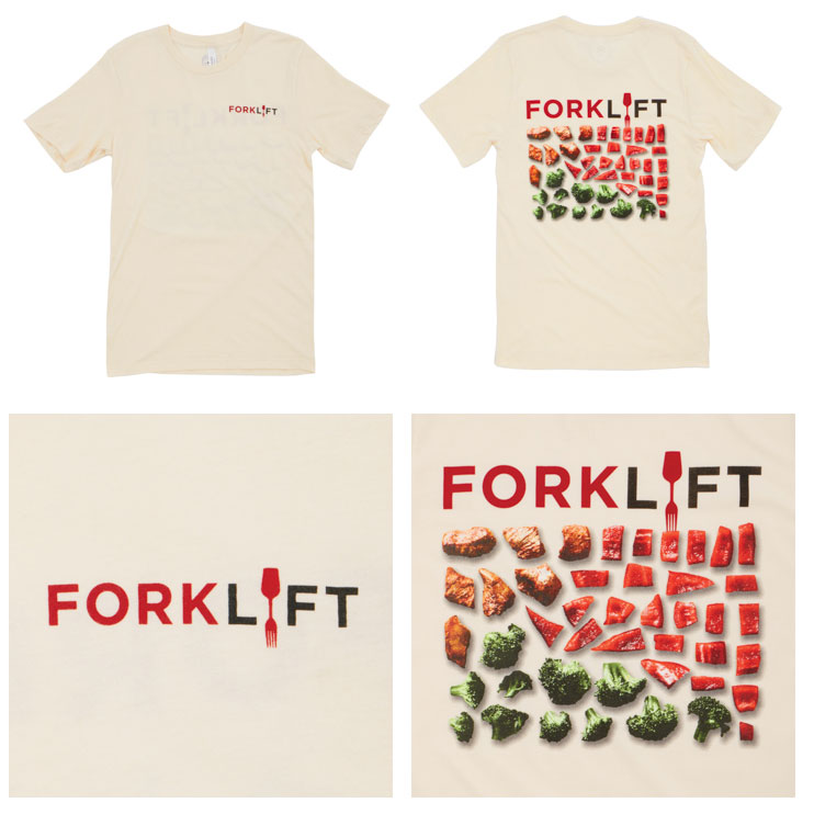
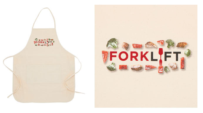
[At top and middle] Unisex jersey T-shirt (3001C) from Bella + Canvas (asi/39590), featuring a two-color screen print on the front and eight-color screen print on the back. Rush Order used four in-house ink colors and four custom-mixed Pantone colors; [At bottom] Two-pocket apron (APR52) from Big Accessories (asi/40485), featuring an eight-color screen print.
Second Runner-Up
Culture Studio, Chicago
Culture Studio’s all-over, soft-hand print created a subtle pattern that would resonate with today’s retro-modern restaurants.
Q: How did you come up with your Forklift outfit?
Justin Lose, art manager: Creating a visual set of components consistent with Forklift’s atmosphere and food was our top priority. We were inspired by the funky patterns found in many Memphis restaurants and the popular minimalism of modern farm-to-table establishments. We brought those concepts to life with an all-over print on a soft, casual red tee. The apron features the Forklift logo in a crisp, bold HD black ink.
Q: How did you create the all-over print on the shirt?
JL: We used a manual press to add a subtle, tone-on-tone pattern of bent forks and other simple shapes on the shirt. We used water-based ink for the all-over pattern, then contrasted that with discharge ink logos on the sleeves.
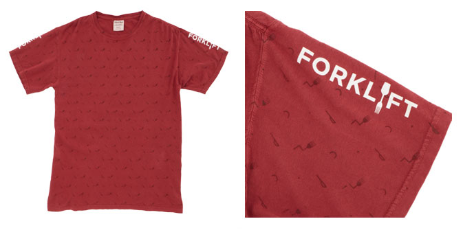
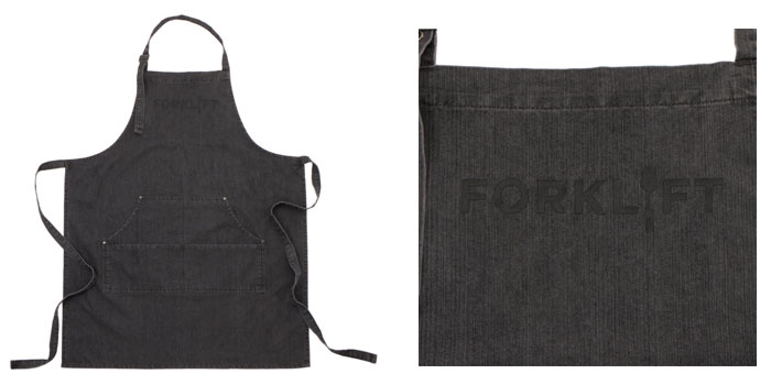
[At top] ComfortWash garment-dyed T-shirt (GDH100) from Hanes (asi/59528), featuring an all-over water-based print with contrasting discharge ink logos on the sleeves; [At bottom] Denim bib apron (RP126) from alphabroder (asi/34063), featuring a high-density black screen print.
Honorable Mention
Country Hillside Embroidery, Ryder, ND
Country Hillside Embroidery used chalkboard vinyl to add a touch of whimsy to a professional-looking button-down uniform.
Q: How did you come up with your Forklift outfit?
Patti Shelkey, owner: I chose a shirt with spandex for comfort and long sleeves to protect the server’s arms from hot plates. The shirt has a professional, almost retro look to it, and the blue color gives an impression of relaxation and calmness. I used the ForkLift logo three times to keep the restaurant’s name in the customer’s mind no matter which way the server stands.
Q: Why did you add a blackboard to the back of the shirt?
PS: The blackboard on the back is a little funky, as Mr. Munch likes to have fun and likes his staff to engage with the customers. A short message is all it would take to get the customer talking. They’ll think it’s very unique. The blackboard vinyl is easy to wipe down, so servers can change the message to whatever they’d like to say each day.
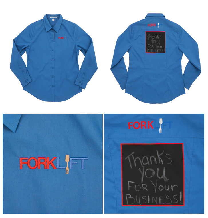
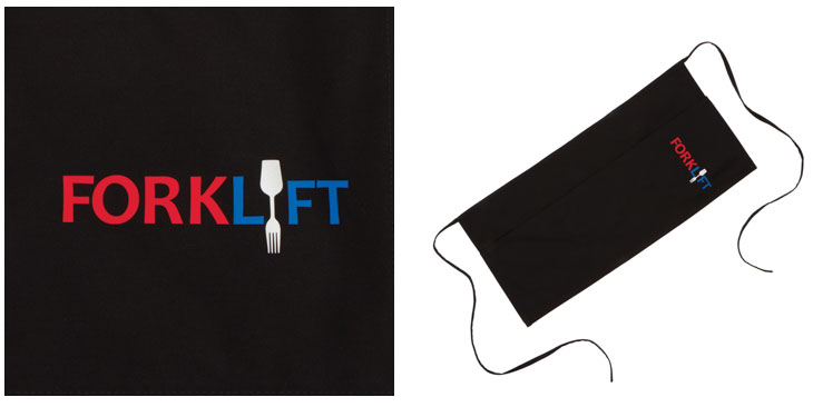
[At top and middle] Long-sleeve stretch poplin shirt (L646) from SanMar (asi/84863), featuring a three-color embroidered logo and a blackboard vinyl decoration on the back; [At bottom] Waist apron (A515) from SanMar (asi/84863), featuring a vinyl logo.
How the Winners Were Chosen
In the first round of judging, Wearables editors evaluated all submissions based on technical skill in decoration, design and functionality. The editors chose eight finalists, which were then posted on ASICentral.com and voted on by Wearables readers through an online poll. The winner and three runners-up – based on the number of votes – will receive a prize package.
What They Won
Grand Prize
• RICOH Ri 100 DTG printer with bundle from AnaJet (asi/16000), valued at $4,950; a $500 gift certificate from Allmade (asi/34341); and a travel prize pack from Hotel Engine and Hertz.
First Runner-Up
• $500 gift certificate from Allmade; a $250 gift certificate from Madeira USA; and a $250 gift certificate from Vantage Apparel (asi/93390).
Second Runner-Up
• $250 gift certificate from Madeira USA and a $250 gift certificate from Bella+Canvas (asi/39590).
Honorable Mention
• One-year complimentary ESP license from ASI.