April 09, 2019
Five Merch Trends From the Masters
Golf’s first major tournament of the year includes frenzied buying of branded merchandise that can herald trends for the promotional products industry.
For golf lovers, The Masters can feel a bit like Christmas in April. The excitement, the anticipation, the tradition, the pageantry – it all makes golf’s first major tournament of the year a thrilling event.
Nothing defines Augusta National more than its incomparable greens. #themasters pic.twitter.com/VcqHBlDx6W
— Masters Tournament (@TheMasters) April 8, 2019
If you’re fortunate enough to attend the famous Augusta, GA, golf club where the competition is annually held, then there’s another parallel with Christmas you’re likely to experience: A lengthy credit card receipt detailing all the Masters-branded merchandise you’ve purchased. Official new Masters merch can only be bought onsite at Augusta National Golf Club – an exclusivity that drives ravenous demand.
From a promotional products perspective, the Masters merchandise collections are interesting because they can spotlight trends we might see in the ad specialty sector in categories that range from drinkware to apparel. (After all, golf wear and golf-inspired looks are the stuff and/or inspiration for much of branded corporate wear.)
While we weren’t lucky enough to score tickets to the tournament and were thus unable to peruse the pro shop for logoed merchandise trends (alas…), Golfweek senior writer Geoff Shackelford was on location to engage in extensive swag-spotting. He created an interesting piece on the 2019 Masters merch, from which we culled five interesting trends with relevance for the promo industry.
Drinkware Decoration Is Getting Busier, More Elaborate
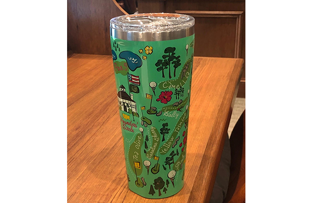
Photo by Geoff Shackelford/Golfweek. View the original here.
Shackelford noted that the most popular item at the shop over the opening weekend was a tumbler embellished with cartoon-like graphics depicting landmarks at Augusta. There were some similarly busy designs – including a floral pattern – on mugs that Shackelford smartphone-snapped. Notably, Starbucks released an autumn collection of drinkware last fall that featured abundant floral graphics. Taken together, a conclusion is that end-users’ tastes might be shifting from the sleek, polished sharp-logo look against a wall of stainless steel to a softer, more colorful drinkware design that incorporates more graphic elements.
Frill Collars on Feminine-Cut Wovens
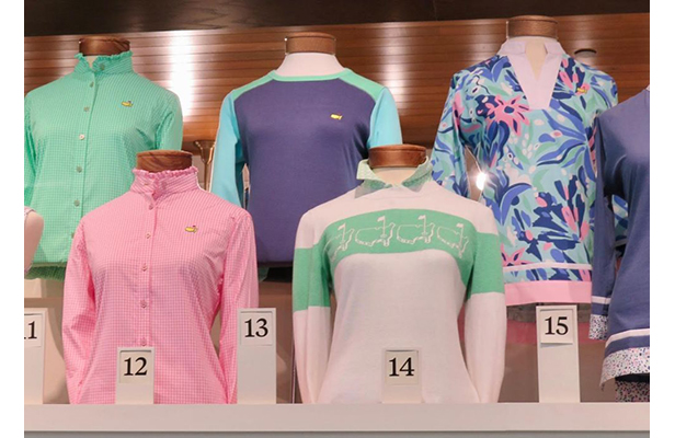
Photo by Geoff Shackelford/Golfweek. See the original here.
The availability of high-quality apparel designed and cut specifically for women has grown exponentially in the promotional products industry and in the traditionally male retail sportswear market, including golf. In the promo industry, perhaps further expansion will see feminine-cut woven button-downs with a turtleneck or mock turtle neck accented with frills, as seen here, come to the branded apparel space.
Pastels for Tees
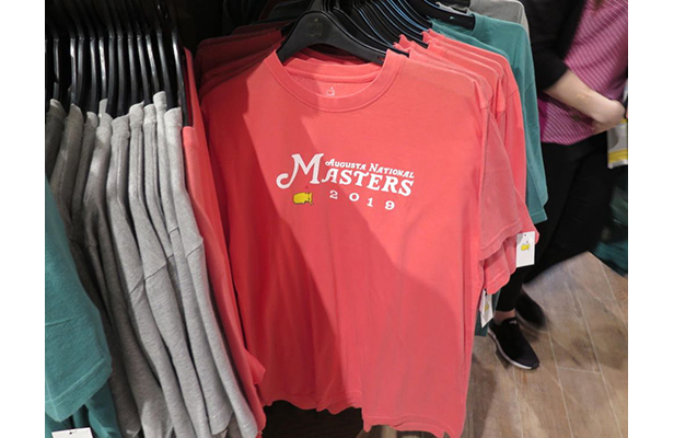
Photo by Geoff Shackelford/Golfweek. See the original here.
The “lobster” color T-shirt shown here points to a broader trend of which promo pros should be aware. End-buyers that range from breweries and colleges/fraternities/sororities, to resorts and golf courses, are increasingly seeking out T-shirts in soft pastels, sometimes with a slightly faded/vintage look. The pastel palette projects a relaxed, summery vibe that evokes lifestyle brands like Southern Tide and Vineyard Vines that’s “in” with a variety of end-users.
Everyone Wants Trucker Hats (With A Patch)
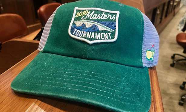
Photo by Geoff Shackelford/Golfweek.
Hardworking, blue collar “trucker” hats at Augusta – a golf course synonymous with America’s version of aristocracy? Yes, as it turns out. Perhaps there’s no greater confirmation of how ubiquitous a style has become than when it enters end-user markets that you might never have imagined. Such is the case here. What’s also notable is that the hat features a logoed patch – a style element that has grown increasingly popular on headwear over the last couple years and that is proving especially sought after with trucker caps.
Simple Text Decoration For Caps
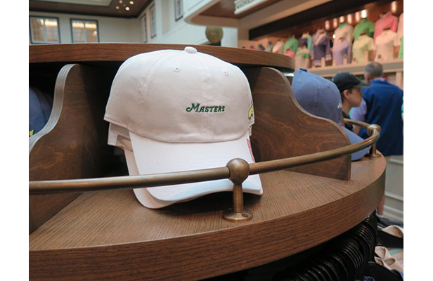
Photo by Geoff Shackelford/Golfweek. See the original here.
While the cap shown here was made for women, Shackelford notes that men “desperately” wanted them as well because of the elegantly simple “Masters” embellishment. Other caps in the collection featured a similarly subtle script styling. So, while some markets might favor the heavier graphics that come with patches and multi-location decoration on headwear, others could be experiencing graphic overload and looking for a touch of understated text-driven simplicity. We could see the subtle font/scripted look playing well on unstructured, curved bill, strap-back “dad hats” at campus bookstores around the country.