December 10, 2021
Very Peri Is 2022 Pantone Color of Year
A play on periwinkle, the lighthearted yet hopeful shade has merit for promo products and corporate apparel.
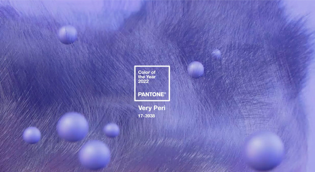
For the 2022 Pantone Color of the Year, an existing hue simply wouldn’t do. So, the Pantone Institute created a new shade for what many are hoping will be a transformative year: Very Peri. A play on periwinkle, it’s ready-made for promo campaigns with a lighthearted, hopeful aesthetic.
“Very Peri brings a novel perspective and vision of the trusted and beloved blue color family, encompassing the qualities of the blues, yet at the same time with its violet-red undertone, it displays a spritely, joyous attitude and dynamic presence that encourages courageous creativity and imaginative expressions,” said Leatrice Eiseman, executive director of the Pantone Color Institute.

In previous years, Pantone would monitor trends in apparel, décor and other areas and choose one of its colors based on its research and forecasting. “The Pantone Color of the Year reflects what is taking place in our global culture, expressing what people are looking for that color can hope to answer,” says Laurie Pressman, vice president of the color institute. For 2022, however, because of the “global innovation and transformation taking place,” Pantone decided to create a new color.
“As society continues to recognize color as a critical form of communication and a way to express and affect ideas and emotions and engage and connect, the complexity of this new red-violet-infused blue hue highlights the expansive possibilities that lay before us,” Pressman says.

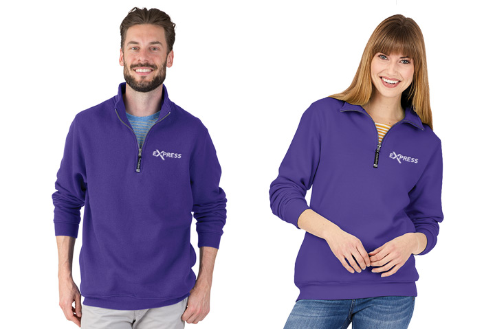
Very Peri works for both men and women. Consider choosing the shade for fleece, like these Crosswind quarter-zips (9359) from Charles River Apparel.
Suppliers in the promo industry are excited by the possibilities the color brings. “We think Very Peri is a fun hue,” says Megan Schmit, marketing communications specialist at Top 40 supplier Charles River Apparel (asi/44620). “It’s a punchier version of a traditional periwinkle and a fashion-conscious color to spearhead newness and offer an optimistic outlook for post-pandemic styling.”

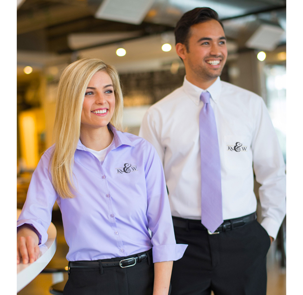
Light purple shades work for uniforming as well, either as a base or as a pop of color. This poplin blouse (5040) is available from Edwards Garment.
For Andra Hasler, senior merchandise designer for Top 40 supplier Edwards Garment (asi/51752), Very Peri is “mood boosting and has somewhat of a calm feeling to it.” She adds: “I think it has the perfect amount of blue and red that makes it not dramatic, but still very eye-catching.”
Very Peri offers versatility to promo. “It can be used to create something we wear, write with or can be used as your favorite drinking vessel,” says Christine Isphording of Buffalo Bay (asi/42416).

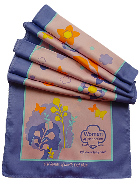
Buffalo Bay made this custom silk scarf with a digital print (1060SS-6) for the Girl Scouts of Northeast Ohio to celebrate the 10th anniversary of its Women of Distinction awards. The artwork on the scarf was created by Lisa Beck.
Though it’s a bit more dramatic than the grays and navies that typically make up corporate apparel, a softened version of the shade could be perfect for promotional apparel, “lending a bit of color into the usual options while remaining relatively neutral as a calming hue,” according to Schmit.
Consider pairing Very Peri with complementary yellows, greens and teals. It also works nicely as an accent to grays. Or create a tone-on-tone look by matching it with a deeper purple shade. If you’re using Very Peri for logos or other decoration, Hasler recommends sticking to a larger scale. “This color might be difficult to read or see if it’s a smaller decoration,” she adds.
The Pantone Color Institute has been choosing the Color of the Year for almost a quarter of a century. For 2021, the institute chose Illuminating and Ultimate Gray as the Colors of the Year. Other recent choices include Classic Blue for 2020, Living Coral for 2019 and Ultra Violet for 2018.

Product Hub
Find the latest in quality products, must-know trends and fresh ideas for upcoming end-buyer campaigns.
