March 15, 2018
The Best Logos in This Year's College Basketball Tourney
Thursday marked the start of National Productivity Not-So-Much Day – otherwise known as the beginning of the NCAA College Basketball Tournament.
Long lunch breaks over wings and pitchers, along with unexpected cases of the sniffles necessitating call-outs, were likely to abound nationally Thursday (and Friday too) as folks flocked to screens to watch the exciting hoops action, hoping they’d called the upsets correctly in their brackets. Indeed, the annual b-ball extravaganza is a time for fun, so some of us here at ASI we’re indulging in a little branding-related levity ourselves, picking what we think are the best team logos of schools participating in the tourney.
What’s your favorite logo from a participating team? Tweet me at @ChrisR_ASI.
Christopher Ruvo, Executive Editor, Counselor magazine
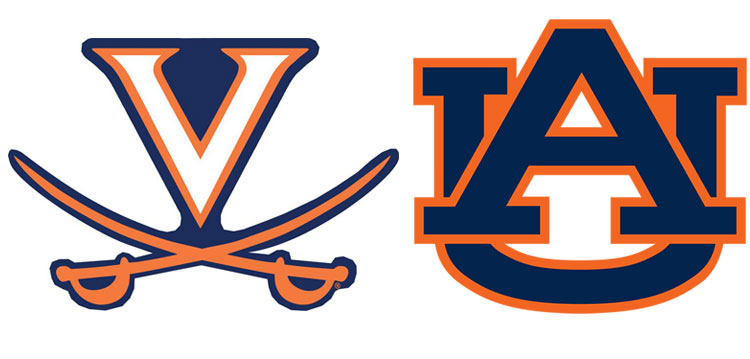
Faves: Virginia Cavaliers and Auburn Tigers.
Why: I suppose I’m a sucker for a little orange. Plus, I like the swashbuckling old-worldliness of the swords and script in the Virginia logo – as if Sir Walter Raleigh himself would have approved. The Auburn logo features a fetching color combo with a classic southern collegiate vibe. I dig that. Sweet tea, anyone?
 Chris' picks: Cavaliers and Tigers
C.J. Mittica, Editor-in-Chief, Advantages & Wearables magazines
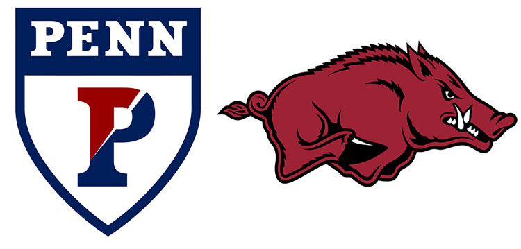
Faves: Penn Quakers and Arkansas Razorbacks.
Why: Says C.J., “I love that Penn has kept its crest instead of replacing it with some generic ‘Fighting Quaker’ caricature -- an oxymoron, I know, but just go with it. The logo says, ‘Hey, we’re a big deal university and not some rubberstamp degree factory.’ Plus, that red and blue ‘P’ is iconic in our hometown Philadelphia area. For something more fun, I’ve always dug the Arkansas Razorback logo. Admit it – if you’re going to name yourself after a hog and have a school-wide rallying cry of ‘Soieeee!’, a mere letter won’t do. I love the sense of motion in this Razorback, and it has just the right amount of menace.”
 C.J.'s picks: Quakers and Razorbacks
John Corrigan, Staff Writer, Editorial
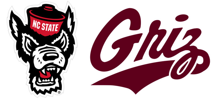
Faves: North Carolina State Wolfpack and Montana Grizzlies
Why: "As a World Championship Wrestling fan, the Wolfpack holds a special place in my heart. The red and black blend well, and the logo looks more feisty than their weak mascot. Montana, meanwhile, has one of the few non-animal logos that I like. The cursive font has a classic, old-school feel, and Griz sounds like the guy at the end of every Montana bar."
 John's picks: Wolfpack and Grizzlies
Vincent Driscoll, Director of ASICentral
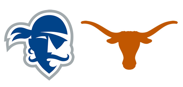
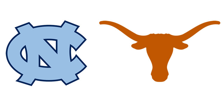
Faves: Seton Hall Pirates and Texas Longhorns.
Why: Vin is a proud Penn Stater, but with his team out of the tourney, he hearkens to his native land of New Jersey when it comes to picking a top logo. “Seton Hall’s pirate design is simple but full of detail. An eye patch, a do rag, a flowing hipster mustache, an earring … it’s all there and in the brilliant school colors of sky blue and white. As for the Longhorns, well, if you didn’t know the nickname of this Texas college team, the logo says it all. Don’t grab this bull by the horns unless you mean business! That’s what this logo says to me.”
 Vin's picks: Pirates and Longhorns
Nathaniel Kucsma, ASI Executive Director of Research and Corporate Marketing
Faves: Clemson Tigers and Wichita State Shockers.
Why: Nate is an analytical fellow, and he feels these logos took a bit of extra conceptual thought. He finds that appealing. “These aren’t just school letters, which you so often see,” he says. “Sure, Wichita State is one of the more cartoonish logos but it really gets your attention as something different. The tiger paw print for Clemson is just really unique. It’s not immediately obvious what it is unless you know college sports. It invites you to learn more and I like that.”
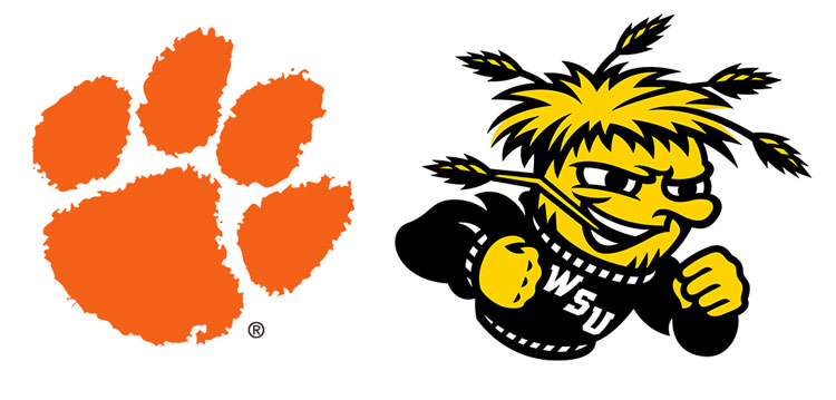 Nate's picks: Tigers and Shockers
Glen Karpowich, Senior Designer, Editorial
Faves: Texas Longhorns and North Carolina Tar Heels.
Why: Glen has a designer’s eye – an eye that favors a clean, crispness that emboldens logos without making them garishly loud. “Both of these logos are easily recognizable and have attractively simple designs,” Glen says.
 Glen's picks: Tar Heels and Longhorns