May 03, 2021
Pastels Offer Calm During COVID
They’ve become more significant than ever before as we grapple with a virus-changed world.
Pastel hues are a perennial favorite in the spring and early summer, but this year they’ve taken on new meaning: They offer a touch of tranquility and calm as we venture back into normal life after more than a year of lockdowns, which can bring its own brand of anxiety.
“We want soft fabrics, soft silhouettes, and pastels feel soft, psychologically,” Carolyn Mair, PhD, a fashion psychologist and the author of The Psychology of Fashion, told fashion news outlet Who What Wear. “They feel gentle and soothing.”
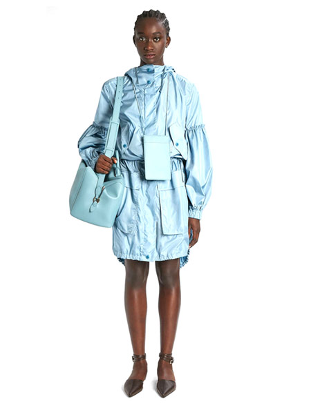
A silk taffeta parka from Max Mara, part of the design house’s spring line.
From the runways to interior design, pastels are in high demand this year as a calming presence while we contend with a (for some) rather jarring return to more normal living, combined with a lingering fear of virus uncertainty.
Featuring printed fabric details reminiscent of a warm-weather morning, and in a prune finish, these 👡 are an ideal accent to any romantic look. https://t.co/KKT1Cgt5eY#CharlesKeithSS21#SummerShoes pic.twitter.com/h8yPQ5v1ZD
— Charles_Keith (@Charles_Keith) May 3, 2021
Interior design studio Desenio calls this renewed love of pastels “Pastel Paradise,” as people spending inordinate amounts of time in their homes now seek to surround themselves with these tranquil hues.
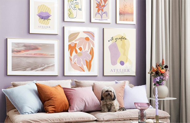
The pastel trend brings a softness to living spaces, in the form of wall paint, pillows and artwork.
“This trend brings much-needed happiness to our homes, focusing on playful, pastel colors in home decor and art,” Desenio Executive Creative Director Annica Wallin told 360 Magazine, a design and fashion trends and news outlet.
In line with current consumer preferences, the promo industry is also seeing this trend take on new life in 2021. “There’s a correlation between the rise of pastels and people seeking calmness and comfort during the pandemic,” says Liz Haesler, chief merchandising officer at Top 40 supplier Polyconcept North America (PCNA, asi/78897). “Pastels remind people of spring, which elicits feelings of happiness and joy. Over the past year, people have sought those feelings through color.”
Gender-neutral mint green has been especially popular this year at PCNA, particularly on journals and drinkware as gift items.
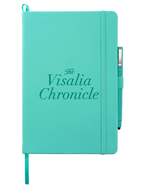
The Vienna journal (2800-36) comes in a variety of colors, including mint green; from PCNA (asi/78897)
While pastels have traditionally been popular among the younger demographics, Haesler says they’re seeing demand now in other applications.
“More corporations are willing to stretch their brand guidelines to better incorporate these colors for a fresh, modern and joyful vibe,” says Haesler. “We’re seeing pastels in work-from-home kits and in boxes of virtual conference and event swag.”
At Diamond Cosmetics (asi/49640), Vice President Lisa Antinelli says the color preferences for branded nail polish has also shifted toward a softer look.
“Right now, our clients are leaning more toward the softer shades rather than the bright and bold colors usually popular during the summer months,” she says. “People are looking for calmness and comfort, something soothing and soft that makes them happier and less stressed.”
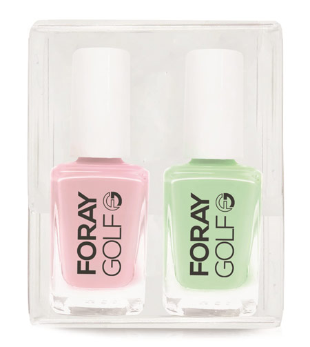
Nail polish set (PL-66S) with pastel hues; from Diamond Cosmetics (asi/49640)
Pale yellows, pinks and purples are out in front currently, says Antinelli, followed closely blues and greens.
“They’ve been gifts for virtual events, as well as recent in-person events like golf outings and awareness campaigns,” she adds. “Pastel purple was used for an Alzheimer’s Disease walk and pastel pink for a Breast Cancer Awareness campaign.”
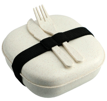
Wheat straw food storage container with utensils (SM-2226); from PCNA
Haesler says a related trend is taking a neutral-toned item and adding a pastel imprint. “Pastels make great additions to any kits where the end-buyers wants to spark joy and bring happiness,” she says, “especially when people are remote.”

Product Hub
Find the latest in quality products, must-know trends and fresh ideas for upcoming end-buyer campaigns.
